Flowers are more than beautiful objects of nature; they are storytellers. A carefully curated bouquet can express love, sympathy, celebration, or gratitude. Behind the emotions flowers convey lies a complex and refined craft—color pairing. In the world of floral design, the choice and contrast of colors are as significant as the flowers themselves. From calming blues and whites to striking reds and oranges, florists use color theory to trigger emotion, enhance space, and create visually balanced floral arrangements that resonate deeply with recipients. Whether crafting a luxurious wedding arch in San Francisco or putting together a modest bouquet for a friend, florists rely heavily on the nuances of color.
Understanding how florists work with hues and contrasts unlocks a greater appreciation for this delicate art form. Let’s delve into how the language of color is harnessed in floristry to stir the senses and tell heartfelt stories through blooms.
The Psychology Behind Flower Color Combinations
At the heart of floral design lies the emotional influence of color. Florists understand that color is not just aesthetic—it’s deeply psychological. Certain hues evoke particular feelings and memories, which is why choosing the right flower color combinations is essential for effective communication through arrangements.
Warm colors like reds, oranges, and yellows tend to convey energy, passion, and warmth. These are often used in celebration arrangements such as birthdays or romantic bouquets. Cool tones like purples, blues, and greens promote calm, serenity, and introspection, making them perfect for sympathy arrangements or moments of reflection. White and soft pastels, associated with purity and innocence, are popular choices for weddings and baby showers.
Florists also consider cultural associations. For example, in many Western contexts, red symbolizes love, but in some Eastern cultures, it can signify prosperity or good luck. This depth of meaning makes color selection a thoughtful process. A skilled florist doesn’t just pick what “looks good”; they curate a palette that speaks to the occasion, audience, and environment.
Mastering Color Theory in Floristry
Color theory in floristry is the framework that guides how hues are selected and arranged to achieve visual harmony or intentional contrast. It includes understanding primary, secondary, and tertiary colors, as well as concepts like complementary and analogous colors. A florist uses this theory not just intellectually but intuitively, often blending the principles into creative expression.
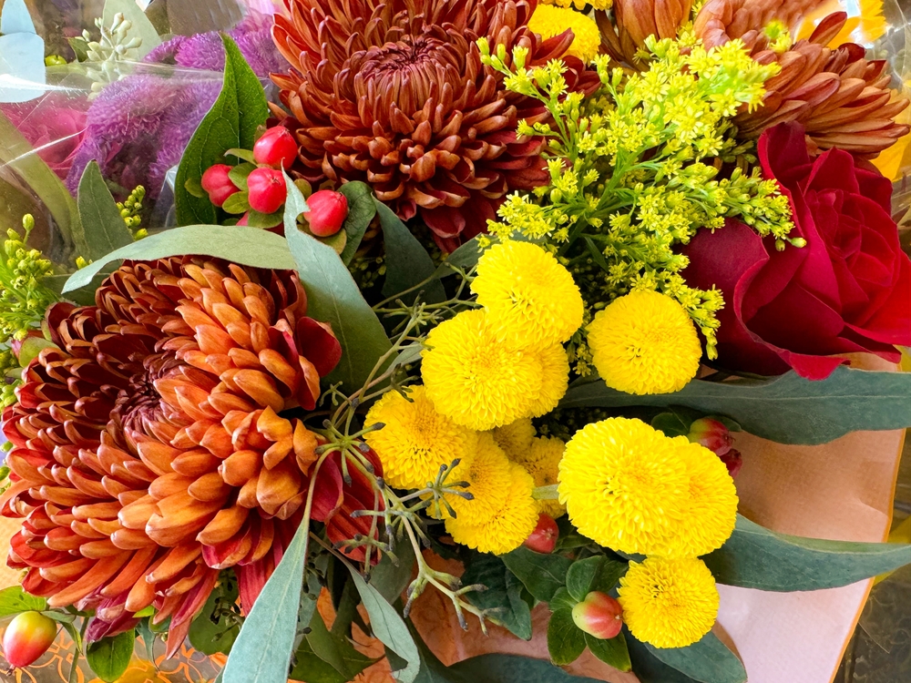
Complementary colors sit opposite each other on the color wheel—such as blue and orange or red and green—and provide bold, high-impact contrast. When used correctly in a flower arrangement, this technique draws the eye and creates a vibrant statement. On the other hand, analogous colors, which sit next to each other (like yellow, yellow-orange, and orange), produce a more harmonious and soothing effect. These combinations are excellent for evoking a particular mood without overwhelming the senses.
In San Francisco’s diverse floral scene, where innovation meets tradition, local florists frequently experiment with unconventional color pairings. By manipulating tone (lightness or darkness) and saturation (intensity), they create nuanced moods. For instance, pairing dusty pink with sage green can evoke vintage romance, while mixing jewel tones like emerald and amethyst adds luxurious drama to event decor.
Using Color to Define Focal Points and Flow
A fundamental goal in floral design is guiding the viewer’s gaze. Just as a painter uses color and light to direct the eye on a canvas, florists use bold or contrasting hues to create focal points within their arrangements. This practice adds structure, rhythm, and movement, helping the bouquet or installation feel balanced and intentional.
The primary focal flower is often the most vibrant or unique in the arrangement. Supporting blooms in softer or contrasting shades enhance its presence without competing for attention. For instance, a bold sunflower at the center of a summer bouquet might be surrounded by white lisianthus, pale peach roses, and blue delphinium. The interplay of color ensures that the sunflower remains the star while the entire piece feels cohesive.
This approach is especially useful in larger-scale floral designs for events or installations. In wedding arches, floral walls, or ceremony backdrops, color can create depth and dimension. Florists in San Francisco’s bustling event industry often use cascading color gradients, starting with deep, intense shades at the base and fading into softer tones toward the top, guiding the eye upward and instilling a sense of grandeur.
Seasonal Inspiration and Regional Color Preferences
Seasonal changes offer florists a natural palette to work with. Spring tends to favor pastels—pale pinks, lilacs, soft greens—while summer explodes with bold and vibrant hues. Autumn brings warm ambers, rusts, and burgundies, and winter leans into crisp whites, deep reds, and evergreen tones. Florists embrace these seasonal cues to reflect the natural world and resonate with current moods and celebrations.
In addition to seasonal variation, regional preferences also influence floral color schemes. San Francisco’s aesthetic is notably eclectic and artistic. Many clients in the area lean toward unconventional and modern arrangements. It’s not uncommon to see neutral palettes with a pop of neon, or muted earthy tones paired with unexpected textures like succulents or dried elements. Florists in the city often fuse classic color theory with trendsetting innovation, creating pieces that feel both grounded and forward-thinking.
Florists must also be sensitive to venue lighting, decor, and even dress colors when designing for events. A well-designed arrangement takes into account how colors will appear in photos, under artificial lighting, or in open-air settings. What looks vibrant in sunlight may seem subdued indoors, prompting adjustments in shade or bloom selection.
Flower Arrangement Tips Rooted in Color Harmony
For those looking to design their own arrangements, applying basic color principles can elevate a simple bouquet to something emotionally resonant. Start by selecting a primary color that conveys your desired feeling—romance, joy, calm—and build your palette around it. Incorporate variations in tone and texture to keep things visually engaging.
Balance is key. Too many high-contrast hues can make an arrangement feel chaotic, while too little variation may cause it to fall flat. Florists often use greenery and neutral flowers as buffers, softening transitions between bold colors or adding restfulness to the composition.
Another pro tip from seasoned florists is to mimic the natural world. Look at how colors appear in nature—such as a wildflower meadow or a garden at dusk—and draw inspiration from that balance. The spontaneity of natural color pairings often leads to the most authentic and heartfelt results.
Finally, don’t underestimate the role of the vessel. The color, shape, and size of the vase or container should complement the floral palette. A minimalist white vase can enhance bright, cheerful flowers, while a vintage glass bowl may add character to an antique-inspired arrangement. Every element, including the negative space, contributes to the overall story told by the flowers.
Conclusion
Color is the soul of floral design. Through thoughtful pairings, contrasts, and harmonies, florists create more than visually pleasing arrangements—they craft emotions, memories, and experiences. The mastery of color theory in floristry allows them to speak a universal language without words, reaching across cultures and contexts to evoke joy, comfort, passion, or peace.
From intimate gatherings in San Francisco apartments to elaborate gala installations, the power of color pairing is evident in every petal and stem. For those seeking to improve their own flower arrangement skills, learning the principles of hue and contrast is a powerful first step. Whether you’re designing with soft pastels or bold complementary tones, remember that each choice of color is an opportunity to connect more deeply with those who will experience your creation.
Floristry is not just about arranging flowers—it’s about composing color, crafting emotion, and painting stories with nature’s most expressive medium. By embracing color theory and tuning into the subtle interplay of shades, anyone can create arrangements that don’t just look beautiful, but feel unforgettable.
Need a Florist in San Francisco, CA?
Here at The Delicate Daisy, we are dedicated to helping you find the perfect flowers for every occasion. Whether you need flowers for birthdays in San Francisco, special occasion arrangements, or just a beautiful bouquet to brighten someone’s day, we have you covered. Our commitment to quality, creativity, and customer satisfaction makes us your go-to florist in San Francisco. Contact us today and let us help you make your moments magical with the beauty of flowers.